
In today’s competitive market, sales teams can’t afford to fly blind. They need real-time visibility into performance, product trends, and team effectiveness to stay ahead. At IMEC, we help organizations unlock their full potential by using business intelligence tools such as Power BI, a powerful, user-friendly platform that transforms raw numbers into strategic insights.
To showcase what’s possible, we created a suite of three interconnected dashboards using a sample dataset. This simulated data allows us to demonstrate the customizable power of business intelligence visualization without relying on proprietary information. These dashboards illustrate how a sales organization can use data to drive smarter decisions, faster action, and measurable ROI, all while tailoring the experience to their unique business needs.
1. Regional Sales Dashboard: See the Big Picture

This dashboard gives leadership a high-level view of total revenue, month-over-month growth, and year-over-year trends. With just a glance, you can:
Track revenue performance across time
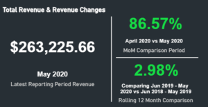
(The current month’s sales performance compared to last month, as well as a rolling year comparison from the current rolling year and the last rolling year.)
Identify top- and bottom-performing products

(There are hundreds of products within the dataset, but we are pulling out the top ten selling products for that month, we are then able to see the revenue change from the month before.)

(Similarly, this chart shows the month’s lowest selling products as well as the difference in sales compared to the month before.)
Spot regional trends and anomalies
Compare current performance to historical benchmarks

(Analyze sales trends over time colored by year spread out across a calendar period to see seasonal trends. Within the report we are able to filter by sales region.)
- Example Insight: A product like Road-350 W Yellow shows a significant revenue increase, signaling an opportunity to double down on marketing or inventory.
2. Product Dashboard: Know What’s Selling—and What’s Not
This dashboard dives deeper into product-level performance, showing:
Units sold by product and profit margins

(Clearly illustrates which products were the top selling by unit and the profit margins for those products. Viewers can focus on increasing efforts to lower costs, increase pricing, or promotion around certain products.)
Monthly sales trends
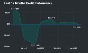
(Show trends in the last rolling year where an organization is turning a profit and where an organization is falling short.)
It’s a powerful tool for product managers, inventory planners, and marketing teams to align around what’s working—and what needs attention.
- Example Insight: A product with high sales but negative margins (e.g., Short-Sleeve Classic Jersey XL) may need pricing or cost adjustments.
3. Sales Team Performance Dashboard: Empower Your People
Your sales team is your engine. This dashboard helps you:
Track individual and team performance
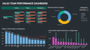
(Compare actuals vs. targets)

(Recognize top performers)

(Who has had the most sales volume in the last 12 months? Who is below the total average?)
With this visibility, sales leaders can manage proactively, not reactively.
- Example Insight: A rep consistently exceeding targets in a low-performing region could be a great candidate to mentor others or lead a pilot initiative.
Why Power BI?
- Interactive & Intuitive: Drill down by product, region, or rep in seconds.
- Real-Time Data: Make decisions based on what’s happening now—not last quarter.
- Customizable: Tailored to your KPIs, workflows, and business goals.
- Scalable: From startups to enterprise, Power BI grows with you.
The IMEC Advantage
We don’t just build dashboards—we build decision ecosystems. Our team works with you to:
- Define the right KPIs
- Connect and clean your data
- Design dashboards that are both beautiful and functional
- Train your team to use them confidently
Sample ROI Calculation
Let’s say these dashboards help your team:
- Identify and eliminate $20,000 in annual losses from low-margin products
- Increase revenue by $30,000 by focusing on high-performing SKUs
- Improve sales team performance by 10%, adding $50,000 in closed deals
That’s $100,000 in value. If the dashboard suite cost $20,000 to build and implement (note: this is a placeholder), your ROI would be:
($100,000−$20,000)/$20,000×100=400%($100,000−$20,000)/$20,000×100=400%
Note: The $20,000 figure is illustrative. Actual pricing depends on project scope, data complexity, and integrations.
Conclusion: Dashboards That Deliver
These mock dashboards are just a glimpse of what’s possible. With the right tools and the right partner, your data becomes a strategic asset, fueling growth, alignment, and agility.
At IMEC, we’re ready to help you turn insight into impact. Connect with Adrian to explore how IMEC can help you leverage business intelligence tools to drive smarter decisions and measurable results.